Tuesday, June 26, 2012
Epic trailer!
The trailer for Blue Sky's new film 'Epic' debuted today on Good Morning America, and we're all very excited about it. The Blue Sky crew is a pretty tough crowd to impress, even our own trailers usually get a mixed applause when we screen in-house, but this morning when it was screened in a large group meeting, there was some of the strongest positive reaction that I've seen from the crew ever. Mike Lee did the color keys for most of these shots here, and they're beautiful. I did the key for the last shot of the two soldiers and slugs, as well as working on the patterning for the armor.
You can watch the trailer and find out a little more here:
http://www.epicthemovie.com/
And of course, don't forget to go see Ice Age: Continental Drift this summer! The Epic trailer will debut before the movie as well, which will be great.
Hooray!
Monday, June 25, 2012
Wedensday Plein Air
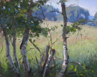
Here are my plein air paintings from the past two Wednesdays. They were fun to do, and though there are always things to improve upon, I was pleased with several aspects of these. The vertical piece of the rocks was a rainy day. We've had a high number of overcast Wednesdays, which is fine because I love the overcast light. The bottom was last week, and it was high 90's and high humidity.
Recent Figure Drawings
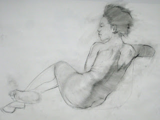
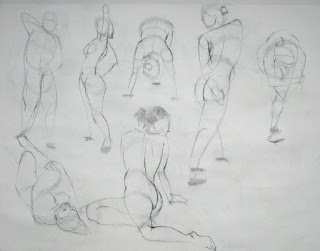
Here are some recent 'best-of' from the figure drawing pile. I know, I know, if this is 'best-of', then we're in trouble! But alas, a blog isn't for perfection, it's about work in progress. I haven't traditionally done as much gesture drawing before Blue Sky, so I'm trying to strengthen my approach and help to economically suggest form and structure. The short poses are mostly 2-5 min, and the more refined pieces are between 20-75 min.
The first piece of the 'Death of Marat' was a fun night. The model is incredible, and he brought foam cubes, sheets, and props, and created this scene, among others. I have rarely seen a model be so artistically informed, or take modeling to such a high level as he does. And you'll notice the little baby drawings at the end here; my little boy came and modeled for us one night. He is not a sedentary boy. So, it was a game of try and get as much information before he moves. Hence the large number of heads:) Enjoy!
Wednesday, June 20, 2012
And...the t-shirts!
I have probably exhausted my postings on Sidewalk Monkeys designs, but I thought I'd throw up the t-shirt designs just for fun. It took so long to get to a half-way decent design for the logo that we might as well celebrate it. Normally I would automatically go for the two-color design over one, but in this case, I feel like both have unique elements that work well.
Tuesday, June 19, 2012
Paul Revere
The top painting is an illustration of Paul Revere for the most recent issue of Seeing The Everyday magazine. The others are various illustrators versions of horses, and Paul Revere. I really haven't painted horses at all, and definitely needed some help, so NC Wyeth was a strong inspiration, as you can see. I usually don't borrow this heavily from other paintings, but there just wasn't other reference available (Google was surprisingly disappointing on this one). This piece was more a practice exercise for me than anything, and I learned so much from Wyeth's dynamic poses and strong brushwork. Wow, that man can paint the horse! About 1:30am as I was cleaning my brushes, I realized that I had made the head too small, and it was starting to look like a little giraffe head. A little Photoshop magic helped fix that this morning before I sent it off for publication, but it was a good reminder that sound drawing underscores everything. And that, like anything else, it just takes practice, practice, practice! I actually highly recommend doing masterwork copies as an exercise to improve, and this piece reinforced that I would benefit from doing more close masterwork study.
Wednesday, June 13, 2012
Tuesday, June 12, 2012
So, a good friend of mine at Blue Sky Studios has just released a book which is so incredible that I simply must share. His name is Mike Lee, and his book is called "Bodega". It is a picture book of 24 images which diagram a day-in-the-life of a corner bodega store in the city. The graphite drawings are absolutely luminous, and his control of the medium is stunning. His understanding of light and form are so strong that you won't find it hard to believe how he is one of the top color-key artists in the film industry. Beyond the flawless technique, he's a clever story-teller, and the simplicity of the style holds layers of complex narratives that are humorous and observant.
You can find out more, including how to order a copy, at his website: mleedrawings.com
Subscribe to:
Comments (Atom)


