Monday, April 30, 2012

Sidewalk Monkeys: Revised Revisions!


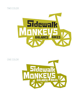
 I think we're finally done. Thanks to some helpful feedback from the client and other designers, I went one more round and pushed the final design a little further.  I pulled it horizontal a little more and pushed some of the size relationships, all with the goal of emphasizing the 'rule of thirds' more. Before, there was a very strong visual line straight down the middle that essentially cut the design in half, and the black ribbon between the words 'sidewalk' and 'monkeys' was too heavy and crossed too many letters, creating visual weight where I didn't want it. I was worried about making the words 'balance bikes' too small, but I think reducing them down helps to have more clearly defined shape relationships and large-small play.

The one color version needed only slight modification, and I think is working very well. I like it on a business card with rounded corners, as I think that plays well with the bike tires, which are the only round thing on the logo. 

Thanks again for the feedback, and remember, just when you think you're really done, you're usually not:)

Friday, April 27, 2012

Sidewalk Monkey revisions


As always, design (and painting) is a process. Here is the final solution to the Sidewalk Monkeys problem. The other versions were really bothering me in that they were, well, just not very good.  Even though they communicated elements that I liked, they didn't do it clearly, and didn't hold the viewer's attention (i.e. boring and confusing). 

So I went down to the basics and did pages of ideas in my sketchbook the last few days on the train to/from work.  There are a lot of things I like about this final version, but I won't go on about it. If it's successful, it should communicate without me needing to explain it.  And if you have comments or things that you see that I haven't, let me know.

Go Sidewalk Monkeys!

Tuesday, April 24, 2012

Sidewalk Monkeys!


So, here is some more graphic design I've been working on. The company sells and rents Stryder balance bikes for kids (bikes without pedals that kids learn to bike on--pretty awesome concept and VERY effective).  I wanted to make something fun that had the angularity of children's art, and I feel like that's coming through for sure. I like the bike version for it's straightforwardness. But I like the space and narrative created in the 'sidewalk' version, and feel like it holds my interest longer. Readability and objectivity are so hard to determine as the designer, so definitely let me know what makes sense and what doesn't. And after all that, do you want to see a monkey? I stayed away from the monkey on purpose because I felt like it was a distraction and didn't communicate any of the main idea. But again, speak your mind. Thanks!

Tuesday, April 10, 2012

Dibble Farms Re-Branding


I have spent the last few weeks re-branding Dibble Farms for my parents. I have subjected them to a lot of mediocre designs in the past, and I'm hoping that this is an improvement! It was fun to keep it simple by limiting it to 1 and 2 color versions. The font is 'Farao' and I found it on veer.com, a great design site. I like how it has solidity, weight, and tradition to it, but it doesn't take itself too seriously. The rough edge also has an earthy, soil-like feel which provides a nice foundation thematically and visually for the barn.

Enjoy, and support your local farmers!